Visualization of clustering the USDA Plants dataset with k-means
In this post, I will be looking at the results of running the k-means clustering algorithm on the USDA's Plants dataset and how to visualize them, and letting you run the algorithm here in your browser (the impatient may now scroll down). As we will see, the algorithm manages to reveal geographical information which is not explicitly represented in the dataset.
Warning: the clustering algorithm is pretty intensive, so I don't recommend running it on mobile devices.
To begin, let us examine the kind of data we'll be dealing with. The Plants dataset (among many others) is available for download at UCI's machine learning repository. It contains a listing of 34,781 plant genera and species, and the states (or provinces) in the US and Canada in which each is found. For example, these are the first ten lines of the data file:
    abelia,fl,nc
    abelia x grandiflora,fl,nc
    abelmoschus,ct,dc,fl,hi,il,ky,la,md,mi,ms,nc,sc,va,pr,vi
    abelmoschus esculentus,ct,dc,fl,il,ky,la,md,mi,ms,nc,sc,va,pr,vi
    abelmoschus moschatus,hi,pr
    abies,ak,az,ca,co,ct,ga,id,in,ia,me,md,ma,mi,mn,mt,nv,nh,nm,ny,nc,oh,or,pa,ri,tn,ut,vt,va,wa,wv,wi,wy,ab,bc,lb,mb,nb,nf,nt,ns,nu,on,pe,qc,sk,yt,fraspm
    abies alba,nc
    abies amabilis,ak,ca,or,wa,bc
    abies balsamea,ct,in,ia,me,md,ma,mi,mn,nh,ny,oh,pa,ri,vt,va,wv,wi,ab,lb,mb,nb,nf,ns,nu,on,pe,qc,sk,fraspm
    abies balsamea var. balsamea,ct,in,ia,me,md,ma,mi,mn,nh,ny,oh,pa,ri,vt,va,wv,wi,ab,lb,mb,nb,nf,ns,nu,on,pe,qc,sk,fraspm
Each line contains the plant's name and a list of the states it's found in. The states are identified by abbreviations, and a separate file lists what each abbreviation stands for. There are 69 states overall.
Before running k-means, we need to do a bit of preprocessing, to convert this into the right form:
- Decide on an ordering to use for the states (alphabetical by abbreviation is natural enough)
- Parse the list of states each plant is present in (and discard the plant's name)
- Encode each plant as a row of 0s and 1s, with 1s for those states it's found in and 0s for the rest
k-means is a very simple algorithm. You have to specify the number of clusters to use (k). Each cluster is represented by a vector in (in our case) 69-dimensional space, whose elements correspond to the 69 states. We may think of this vector's elements as each representing the probability that a plant chosen at random from this cluster is found in that state. The algorithm proceeds iteratively, with two steps in each iteration:
- Each plant is assigned to a cluster, according to which cluster's center it's closest to.
- Each cluster center is recalculated using this new assignment, by taking the average of all the plants assigned to that cluster.
Visualizing the clusters
The output from running k-means is the classification of the plants into clusters, together with the centers of the clusters. One common way to visualize a classification is using a scatter plot, where each point represents a plant and its color indicates which cluster it belongs to. Since each point lies in 69-dimensional space, in order to plot the points, we need to project them onto two dimensions, for example with multidimensional scaling (MDS). This will give us a plot such as this one, using six clusters:
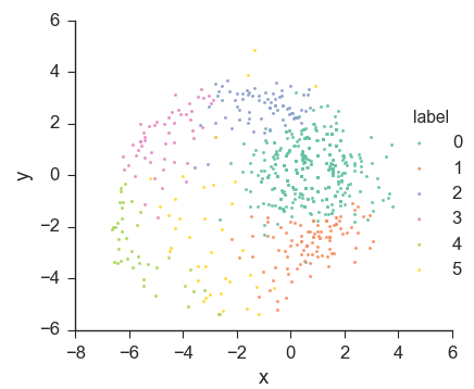
We can see that this does generally look like a clustering. But the plot suggests that this dataset does not consists of six well-separated clusters, since it looks more like a circle cut into 6 slices than completely separate groups of points. We may also notice the yellow points at the top, far away from the yellow cluster. This might suggest that these points were misclassified, since they appear to be closer to the blue cluster than to the yellow one. However, this is merely an artifact of using MDS. After all, with k-means, every point gets assigned to the cluster whose center it's closest to. This means that, in the original 69-dimensional space, these yellow points must actually be closer to the yellow cluster's center than to any other's. MDS attempts to preserve the distances between the points as much as it can, but cannot do it perfectly, and artifacts such as this are to be expected.
But we can do better!
Choropleth maps to the rescue
Luckily, we have some domain knowledge about our dataset. We know that the 69 dimensions represent the 69 states, and we can draw states on a map. We can then represent a vector in 69-dimensional space by coloring each state according to the value it has in the vector. In case you ever want to google that, the technical term for this is 'choropleth map'.
This way, we will be able to visualize each cluster's center as a map, and the clustering as a whole as a set of maps. And, thanks to modern browser technology, we can even visualize the k-means algorithm in action:
The average probabilty of a random plant being found in a random state is represented as white, values above that as green, and values below that as red. You may have noticed that more states start out green than red. That's because I initialize the clusters with uniform random numbers between 0 and 1, but the overall average in the dataset (represented as white) is about 0.13, which is a good bit lower than 0.5.
Now, if you run the algorithm, you can see how the initial random cluster centers gradually improve until the algorithm convergence. The maps of the final cluster centers no longer look like maps colored at random. Instead, we see green regions, and red regions, and white regions in between them, because the distributions of plant species tend to vary continuously over such large land masses as the US and Canada.
Of course, the colors on the map don't really vary continuously. Each state is colored with a single color, because our dataset contains plant data by state, not by continuous quantities such as latitude and longitude, nor by finer-grained discrete entities such as counties. However, the differences we see in color between neighboring states should be small.
How do we interpret these maps? Within each map, the color of a state represents how likely it is than a random plant from that cluster would be found in that state, relative to how likely a random plant from any cluster would be. If the state is green, plants from that cluster are more likely to be found in that state than plants on average, and the opposite goes if the state is red.
So, for example, a cluster which is mostly green in the West and mostly red in the East is easy enough to interpret. But we often also see some clusters in which the entire map is red, or the entire map is green. These are clusters whose defining characteristic is the average number of states in which their members are found. For example, a map that's all red corresponds to a cluster whose plants are found in less states than average and are not (as a whole) distributed significantly more in some regions than in others.
But, wait, there's something wrong!
You probably already noticed it. If not, have a look again, maybe you'll see it. Or maybe you had some bad luck, and the clustering you got doesn't make the problem visible enough. Try to reset the maps and run the algorithm again. Do you see it now?
Clustering reveals an error
For some reason, we usually end up with a couple of states that just don't seem to fit in. It might be a green state surrounded by red states, or a white state surrounded by green states, or any other of the possible things which don't look right. And it's always the same two: Alabama and Alberta.
As it turns out, there is a very simple explanation: the abbreviations file that came with the dataset has Alabama and Alberta flipped relative to how they're actually used in the dataset. It says "ab" for Alabama and "al" for Alberta. To check that it's actually wrong, we can look back to the first ten plants I listed above, where we see that abies balsamea (the balsam fir) contains "ab", but not "al". Therefore, if we find out whether balsam fir is present in Alberta or Alabama, we'll know which state "ab" really stands for (in this dataset). To do this, we'll consult the USDA website's page. There, we see that it's found in Alberta and not in Alabama, which tells us that "ab" stands for Alberta, and that the abbreviations file did get it wrong.
With this knowledge, we can fix the states abbreviations mapping used during preprocessing, which takes care of the problem and gives us:
So what?
I initially chose this dataset for clustering because I like plants and because the geographic nature of the dataset allows visualization of the clusters using choropleth maps, unlike most high-dimensional datasets, for which finding good visualizations is a problem. As expected, the k-means algorithm managed to partly reveal the geographic structure of the states: even though the dataset contains no explicit information as to which states are close to which other states, this information is implicit in the distribution of plants between the states, and is present in a more summarized (but still implicit) form in the clusters found by k-means.
It would be an interesting exercise to see how well the relative positions of states (or, rather, 2D values which correlate highly to them) could be recovered from cluster centers, perhaps running clustering many times and recording all the centers we get. We would not expect jaw-dropping results, because differences in flora don't depend directly on latitude and longitude, but on a variety of factors, such as topography, climate, soil, and a million other things. For example we would expect larger differences in the flora if we went from one side of the Rockies to the other than if we covered a similar distance in the great plains. Still, we would expect some likeness of the spatial relationship between states to be implicit in the cluster centers, and that it should be possible to visualize it by projecting them onto two dimensions, using multidimensional scaling for example.
Granted, this should also be possible using the original dataset, without clustering. We could consider each state to be a row rather a column. Then our dataset would consist of 69 vectors in a 34,781-dimensional space, which we could then project onto two dimensions using MDS. However, if the results from the cluster centers turned out to be close to as good, the clusters would be serving as a sort of summary here, too, since the states' vectors would be in a lower dimensional space (one dimension per cluster).
Finally, what impressed me the most was that visualizing the clusters led to the discovery of an error in the abbreviations file that came with the dataset. Needless to say, this was completely unexpected.
Actually, though, it was not k-means that found the error, but rather k-means combined with a suitable visualization method. In fact, I would never have discovered the error if I hadn't visualized the cluster centers using choropleth maps, because the error only becomes apparent when you see the values for the states placed in their positions on the map. If you think about it, the error could even have been discovered without any clustering, by simply drawing choropleth maps for individual plants. Sooner, rather than later, one would come upon a plant which, for example, seems to be found in all the states around Alberta but not in Alberta itself, which would be suspicious and might prompt one to do a sanity check by looking for the map on the USDA page.
The lesson to be drawn is that we should never underestimate the importance of finding appropriate visualization methods and that we should not rely on cookiecutter advice, but rather carefully consider and experiment in order to find the most appropriate visualizations for our data.
---
The source code for this post, including k-means itself and the code for generating the choropleth maps, can be found in my website's repository on Github.